This subchapter is provided as a free sample for Swift Charts Beyond the Basics book.
You can read it online or download the sample bundle with PDF and EPUB by clicking the link below.
Download free sampleTo get access to the contents of the whole book you need to purchase a copy.
FREE SAMPLE - online version
Categorical grouping
Categorical datasets often describe more than one level of grouping. Several observations may belong to the same primary category while representing different activities, conditions, or series. Placing these subcategories beside one another keeps the larger groups intact and makes their values directly comparable.
Swift Charts adds this positional encoding with position(by:axis:span:). The modifier uses the subcategory to divide space along the selected axis. When needed, span controls the total space available to the positioned content.
# Subcategories within primary bands
A categorical scale gives each primary category a band that can be divided among its subcategories. Consider a dataset that records the hours each team member spends on research, design, and development. The following chart groups the activities within each team member's horizontal position:
Chart(activityHours) { item in
    BarMark(
        x: .value("Team member", item.teamMember),
        y: .value("Hours", item.hours)
    )
    .foregroundStyle(by: .value("Activity", item.activity))
    .position(
        by: .value("Activity", item.activity),
        axis: .horizontal
    )
}
Each team member now has three bars, one for each activity. Their heights show the recorded hours, while color repeats the activity encoding so that research, design, and development remain identifiable across the chart.
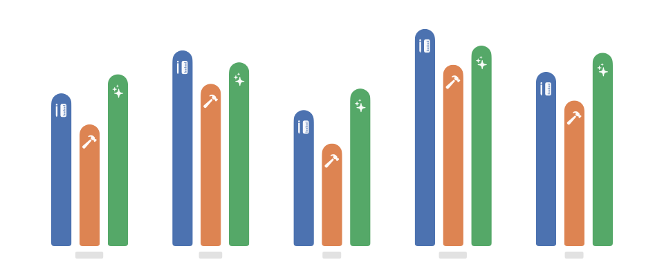
The teamMember value establishes each horizontal band, and position(by:axis:) divides it using activity. Swift Charts derives the shared activity order from the first occurrence of each value and reuses it for every team member. Individual groups cannot arrange the same activities in different orders.
Here the grouping runs horizontally because the team members occupy positions along the horizontal axis, so axis uses the horizontal case. A horizontal bar chart would use the vertical case because its primary categories appear along the vertical axis.
# Grouping within calendar periods
Calendar periods behave differently because dates remain on a continuous scale. Supplying a calendar unit identifies the period represented by each observation, but it does not give every mark a width within that period.
We can see the difference by applying the same monthly values and activity grouping to bars and lines:
Chart(monthlyActivityHours) { reading in
    BarMark(
        x: .value("Month", reading.month, unit: .month),
        y: .value("Hours", reading.hours)
    )
    .foregroundStyle(by: .value("Activity", reading.activity))
    .position(
        by: .value("Activity", reading.activity),
        axis: .horizontal
    )

    LineMark(
        x: .value("Month", reading.month, unit: .month),
        y: .value("Hours", reading.hours),
        series: .value("Activity", reading.activity)
    )
    .foregroundStyle(by: .value("Activity", reading.activity))
    .position(
        by: .value("Activity", reading.activity),
        axis: .horizontal
    )
}
The activity bars appear beside one another within every month. The three lines continue to pass through the center of each monthly period instead of shifting horizontally to meet their corresponding bars.
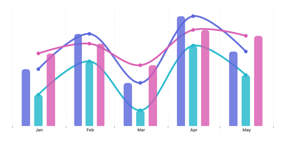
BarMark derives an automatic width from the month, giving position(by:axis:) a region to divide. Each LineMark contributes only a position at the center of that period, so the activity value does not move the line observation away from its temporal position.
When a temporal comparison needs its subcategories placed side by side, bars and other marks with extent along the temporal axis can use the calendar period directly. Points and connected series remain anchored to their temporal positions even when their dates include a calendar unit.
# Positioning compound content
One observation may require several marks that need to move together. A Plot collects those components so that we can apply one positional modifier to the complete representation.
Consider annual water-intake summaries that compare daytime and nighttime measurements. Each summary describes the complete measured range, the range containing the middle half of the values, and the median. We can represent these properties with a rule for the complete range, a rectangle for the middle half, and a narrow rectangle for the median:
Chart(summaries) { summary in
    Plot {
        RuleMark(
            x: .value("Year", summary.year, unit: .year),
            yStart: .value("Minimum water intake", summary.minimum),
            yEnd: .value("Maximum water intake", summary.maximum)
        )

        RectangleMark(
            x: .value("Year", summary.year, unit: .year),
            yStart: .value("Lower quartile", summary.lowerQuartile),
            yEnd: .value("Upper quartile", summary.upperQuartile),
            width: .ratio(0.7)
        )

        RectangleMark(
            x: .value("Year", summary.year, unit: .year),
            yStart: .value(
                "Median lower edge",
                summary.medianLowerEdge
            ),
            yEnd: .value(
                "Median upper edge",
                summary.medianUpperEdge
            ),
            width: .ratio(0.7)
        )
    }
    .foregroundStyle(by: .value("Day or night", summary.dayOrNight))
    .position(
        by: .value("Day or night", summary.dayOrNight),
        axis: .horizontal
    )
}
The daytime and nighttime box plots appear beside one another within each year. Every whisker, quartile range, and median stays aligned with the other parts of its box plot.
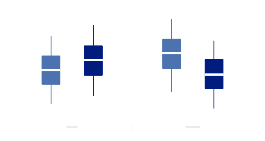
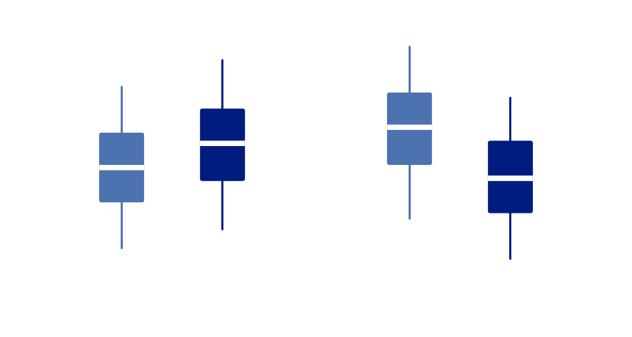
The year value associates each summary with an annual period, and dayOrNight selects its position within that period. Because foregroundStyle(by:) and position(by:axis:) are attached to the surrounding Plot, Swift Charts styles and moves all three marks together. We can also apply an accessibility label and value to the same Plot so that accessibility technologies present the summary as one observation.
Positional grouping works at the level where we apply the modifier. On an individual bar, it selects a position within a categorical band or calendar period. On a Plot, the same encoding positions the complete compound observation while preserving the relationships among its components.