This subchapter is provided as a free sample for Swift Charts Beyond the Basics book.
You can read it online or download the sample bundle with PDF and EPUB by clicking the link below.
Download free sampleTo get access to the contents of the whole book you need to purchase a copy.
FREE SAMPLE - online version
Heat-map grids
Some datasets associate an aggregate with each region of a two-dimensional domain. A heat map preserves the spatial arrangement of those regions and uses a visual encoding, commonly color, to represent the value calculated for each one. The geometry needed to position a region depends on the shape of its grid cell.
# Rectangular heat-map cells
A rectangular heat-map cell represents the intersection of one range on the horizontal axis and another on the vertical axis. When observations have been grouped with NumberBins along both dimensions, each aggregate contains horizontal and vertical bin ranges together with a value calculated from the observations within their intersection.
Consider product observations grouped into price ranges and sales-volume ranges, with total sales calculated for every combination:
// Each cell contains product-price and sales-volume ranges from
// NumberBins, plus the total sales aggregated within those ranges.
RectangleMark(
    xStart: .value("Product price from", cell.priceRange.lowerBound),
    xEnd: .value("Product price to", cell.priceRange.upperBound),
    yStart: .value("Sales volume from", cell.salesVolumeRange.lowerBound),
    yEnd: .value("Sales volume to", cell.salesVolumeRange.upperBound)
)
.foregroundStyle(by: .value("Total sales", cell.totalSales))
The xStart and xEnd values place the left and right edges of the cell, while yStart and yEnd place its lower and upper edges. These four values determine the rectangle's position and extent. The foreground style independently maps totalSales to color. The following illustration isolates one cell and the four boundaries that define it:
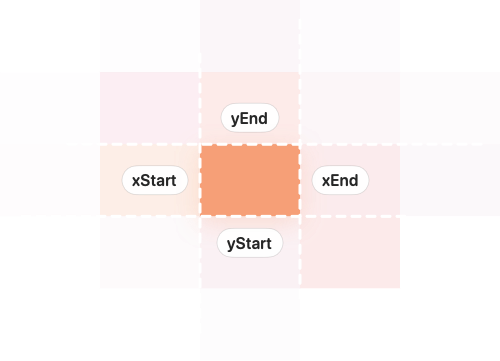
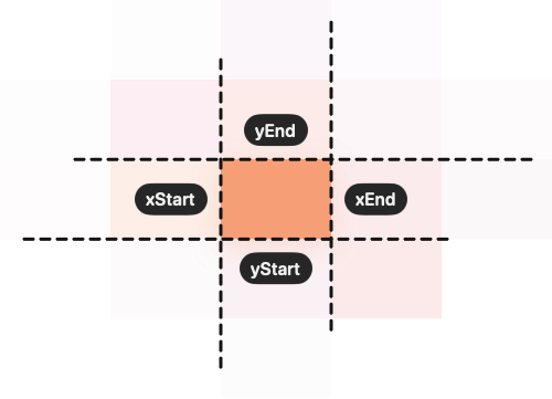
Because neighboring bins share their boundary values, their rectangles meet without leaving gaps. We can create visible separation between the cells in screen space without changing the data ranges they represent.
For a vectorized RectanglePlot, the PlottableProjection.value(_:_:_:) overload supplies the lower and upper bounds as one projection for each axis. This form also lets us provide inset dimensions for the complete horizontal and vertical ranges:
RectanglePlot(
    cells,
    x: .value(
        "Product price",
        \.priceRange.lowerBound, \.priceRange.upperBound
    ),
    y: .value(
        "Sales volume",
        \.salesVolumeRange.lowerBound,
        \.salesVolumeRange.upperBound
    ),
    width: .inset(1),
    height: .inset(1)
)
.foregroundStyle(
    by: .value("Total sales", \.totalSales)
)
.cornerRadius(4)
Each projection retrieves both boundary values for a cell. RectanglePlot derives the cell's complete width and height from those values, then inset(1) removes one point from each side in screen coordinates. The corner radius rounds the resulting rectangle. These adjustments distinguish neighboring cells visually without changing their encoded ranges or aggregated values.
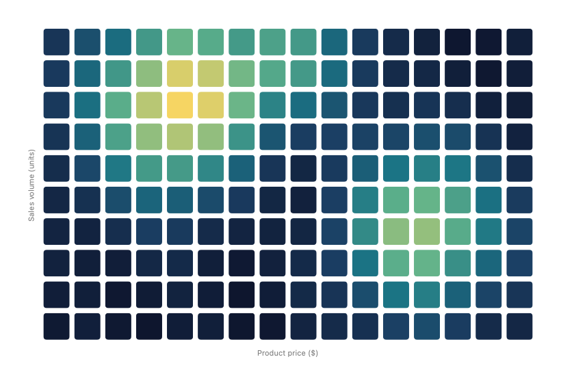
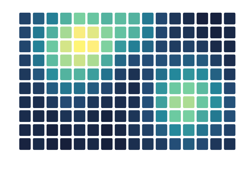
The visible gaps make the individual price and sales-volume regions easier to distinguish, while color continues to show how total sales vary across the grid.
# Nonrectangular grids
Cells whose shapes cannot be described by horizontal and vertical ranges need a different representation. Instead of supplying the boundaries of each region directly, we can position a point at the cell's center and use a custom symbol to provide its visible shape.
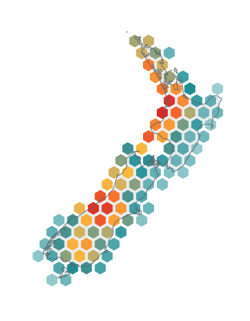
Consider a spatial summary that groups recent earthquake observations into hexagonal cells. Each cell records the number of earthquakes assigned to it and is identified by axial q and r coordinates stored in HexCell.ID. These coordinates locate the cell within the hexagonal grid. As part of preparing the data, the grid converts them back into the latitude and longitude of the cell's geographic center.
The following chart uses that center to position a PointMark for each cell:
PointMark(
    x: .value("Longitude", cell.center.longitude),
    y: .value("Latitude", cell.center.latitude)
)
.foregroundStyle(
    by: .value("Recent earthquakes", cell.recentEarthquakes)
)
.symbol {
    Hexagon()
}
The longitude and latitude values anchor the geographic center of the cell. The application-specific Hexagon shape supplies its visible region around that position, while the foreground style maps the aggregated earthquake count to color. The following illustration separates these responsibilities by showing the center positions within the hexagonal regions:
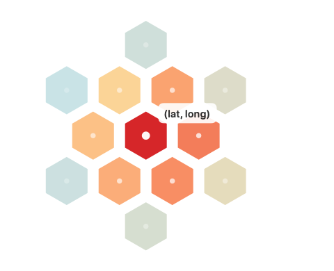
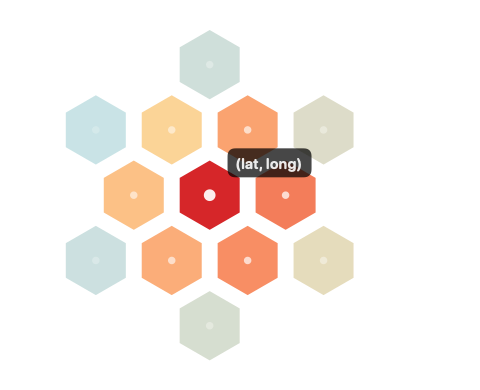
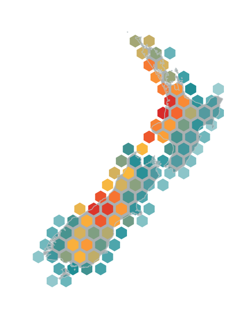
Using the geographic center of every occupied cell preserves the spatial relationships established by the grid. Placing those cells over the corresponding geographic context produces the following map:
The chart also needs an accessible description of the region and the aggregate represented by its color. If the prepared data associates each cell with a recognizable regionName, we can add the corresponding modifiers to PointMark:
.accessibilityLabel(
    Text("Recent earthquakes near \(cell.regionName)")
)
.accessibilityValue(
    Text(cell.recentEarthquakes, format: .number)
)
The accessible representation now identifies each cell by a meaningful geographic region and reports the earthquake count encoded by its color.
By matching each mark's positioning strategy to the geometry established during data preparation, we can preserve the grid's spatial relationships while giving every aggregate an appropriate visual and accessible representation.